Showing posts with label Gorgeous Grunge. Show all posts

Wednesday, 8 July 2015

Stampin' Royalty - Colour challenge


Today is the time to reveal the second challenge for my guest DT stint over at Stampin' Royalty. Thank you for everyone for submitting your gorgeous flower themed creations last week. This week we have a colour challenge for you - Old Olive, Soft Suede, Tangelo Twist and Very Vanilla. If you don't have these colours, you can use anything you have that is close. If you hop over to Stampin' Royalty you will see the gorgeous inspiration from the DT. 


As I went with a super feminine card last week I thought it was time for something for the males this time. I masked off the edges of a panel of Very Vanilla card and used a foam applicator to sponge a light layer of Soft Suede. I then stamped the ship from The Open Sea set. After masking off the ship, I stamped the World map in the background after first stamping it off once so it won't be too prominent. Then I added splotches from the Gorgeous Grunge set, again after stamping them off first. Last, I stamped the sentiment from the Just Sayin' set in Old olive, and fussy cut it. Then I realised I actually have the dies for the speech bubbles and felt a bit silly about fussy cutting. Last, I stamped the anchor from The Open Sea in Calypso Coral and fussy cut that too. As a finishing touch I added some Soft Suede around the edges of the front panel and attached to a Very Vanilla card.

I would like to link up with the following challenges:
STAMPlorations - July challenge Stamp and Distress
Inkspirational - Grunge
Make My Monday - The Sea

Card: Stampin' Up Very Vanilla
Ink: Stampin' Up Old Olive, Soft Suede and Calypso Coral
Stamps: Stampin' Up The Open Sea, World Map, Just Sayin', Gorgeous Grunge

Monday, 6 July 2015

Surprise guest DT card


I've been dying to tell you, and today is finally the day. I'm soooo excited to be guest designing for the STAMPlorations sketch challenge as my narwhal card was picked as one of the top picks for sketch #33!!! I love playing along with their amazing sketches so I'm very honoured to be joining the amazingly talented DT for the current challenge. You have lots of time to play along as the deadline for this challenge isn't until the end of July! Hop over to the STAMPlorations blog to see what the rest of the DT have created using this amazing sketch and make sure to join in the fun.

For my card, I was working with the STAMPlorations Tropical Drink digi. I wanted summery colours and went with Stampin' Up Calypso Coral, Pistachio Pudding and So Saffron. I started by watercolouring the background. After the colours had dried, I stamped the Tim Holtz Script and Curiosity stamps, and added some splotches using the Gorgeous Grunge stamp set. I printed the digi and coloured using the same colours. I also printed the digi onto vellum and cut out the glass to give it a more "glassy" look, although it doesn't show very well in the image. I stamped splatters around the glass and sentiment using the Gorgeous Grunge stamp and matted them onto Calypso Coral card. I also added one panel from the Sweet Sorbet DSP. I think it ended up being a wonderfully summery card, and I really want a nice cocktail now...


Card: Stampin' Up Calypso Coral, So Saffron, Daler&Rowney 300 gsm Aquafine watercolour paper, 160 gsm Hobbycraft white card
Stamps: STAMPlorations digi stamp Tropical Drink, Each Day Holds a Surprise, Stampin' Up Gorgeous Grunge, Tim Holtz script and curiosity stamps
Ink: Stampin' Up Calypso Coral, Pistachio Pudding, So Saffron 
Paper: Stampin' Up Sweet Sorbet


Sunday, 7 June 2015

Summery swallowtail get well soon card


What a great weekend it's been. The ever so elusive sun has not been shy, and it almost feels like summer! Yesterday we bought a huge pile of strawberries, and I was planning on freezing some of them. However, by some mysterious power, they are almost gone already... I wonder who comes into my kitchen and eats my strawberries? Today we took the bikes out for a ride around the reservoir. I keep forgetting we live so close to great biking routes, although that was one of the reasons we did move out into the countryside. Anyhow, it was great to enjoy the sun and the wind in my hair. I could have done without the swarming insects that made their way up my nose, into my mouth and inside my Oakleys. Now I can't wait to dine on the leftovers from yesterday's BBQ.

With all the other stuff going on I'm not quite sure where I found the time to craft, but this weekend has seemed so blissfully long. So I did manage to steal some time in the craft room. I was inspired by the sketch over at CAS(E) This Sketch as well as the colour challenge over at ColourQ. Although I didn't have the Stampin' Up colours Island Indigo or Hello Honey, I did manage to find very close matches from the Tim Holtz Distress colour palette as two of the new colours, Fossilized Amber and Mermaid Lagoon, are very similar. And it was a great reason to get to use these new gorgeous colours. I was also inspired by the butterfly theme over at Addicted to CAS. I'm also linking up over at Addicted to Stamps where the theme is Make Your Mark (as I coloured the butterfly using markers). Last but not least I'm linking up with Just Us Girls where the theme this week is Summer.

I think this swallowtail stamp is one of the most gorgeous I have ever come across. I keep going back to it over and over. For the card, I cut out the two white panels and stamped the swallowtail in black ink. I then heat embossed it with clear powder, and coloured using markers. Then I realised I don't have matching cardstock to the Mermaid Lagoon and thought I would have to scrap the whole idea of the card I had in my mind, until I realised I have white cardstock, I have the ink pad and a foam applicator for the ink - and hey presto, Mermaid Lagoon coloured cardstock for matting. Such a simple solution but it took my two brain cells a while to get there... I used two sentiment from Lawn Fawn Scripty Sayings, one of my favourite sentiment sets at the moment and stamped them in black. Last, I inked up the Gorgeous Grunge stamps using markers and stamped splatters all over. 

Card: 300 gsm white card, Hobbycraft 160 gsm white card
Stamps: Stampin' Up Swallowtail, Gorgeous Grunge, Lawn Fawn Scripty Sayings
Ink: Memento Tuxedo Black, Tim Holtz Distress Inks Fossilized Amber, Mermaid Lagoon, Ripe Persimmon
Other: Ranger Ultra Fine Clear Embossing Powder

Saturday, 30 May 2015

Great CAS(E) this Sketch and some more craft room organizing


Summer and crafting just don't seem to go together. There is so much to do, and the days just pass by so quickly. Of course the fact that I have also spent a few evenings just lazily falling asleep on the sofa while watching TV really doesn't help either, does it? But today I'm home alone and after having finished my rat shopping in the morning (yes, the babies have to eat although daddy is out and about), I did camp out in the craft room and have been multitasking crafting, getting inspired, cleaning and organising.

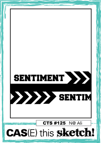
Today's card is inspired by the awesome sketch over at CAS(E) This Sketch. I was also inspired by the great colour combo over at Colour Me...! I am linking up over at Simon Says Stamp Wednesday Challenge where Anything Goes as well. I went for a very literal interpretation of the sketch this time. I created the chevrons in the background by colouring parts of the Positively Chevron background stamp using markers. I also coloured the Gorgeous Grunge stamps using markers to get the coloured splatters for the background.


I've also been organising my stamps and dies. I finally got the Avery Elle Stamp Storage pockets I ordered a while ago. I think my stamps look so much neater now that they are all in identical pockets. I have put in a cardstock sheet for support in the pockets along with the stamps. For sets with matching dies, I bought some magnetic sheets which I attached to black cardstock, and the dies stay beautifully organised on the magnetic sheets. I have popped the dies into the same pockets with the matching stamps, so now it's always easy to find the matching stamp sets and dies, and I know even the tiny little dies stay safe on the magnetic sheets and in the sealable pockets. Unfortunately some of the larger stamp sets don't fit in the pockets, so I have to figure out something else for them.


Stamps and dies stored in plastic pockets. Matching dies
are stored along with the stamp sets. 
Card: Stampin' Up Rich Razzleberry, Hobbycraft 160 gsm white card, scraps of Bermuda Bay and Tangerine Tango Card
Stamps: Stampin' Up Positively Chevron and Gorgeous Grunge
Ink: Stampin' Up Rich Razzleberry, Tangerine Tango, Bermuda Bay
Other: Stampin' Up Hello You dies


Saturday, 21 February 2015

Retro colours


Today's card is a play around with the colours from this week's Colour Me...! challenge, and this is what I came up with. It was supposed to be something completely different but turned into this instead. Oh well, it's always a journey. I was also inspired by the Just Add Ink "Just Add Thank You" theme. 
I absolutely adore Vintage Photo, it's the most amazing brown colour and I use it all the time. This time I inked it through a Tim Holtz stencil to create a background. I punched the flowers and inked around the edges in matching colours, and added a big rhinestone after shaping the flowers for a bit of a 3D effect. I stamped the butterfly and fussy cut before adding the clear jems. Last I stamped using Gorgeous Grunge for the splatters, stamped the sentiment, and inked around the edges of the front panel which I adhered with foam pads.

Card: Kraft card, Stampin' Up Pool Party, So Saffron and Real Red card
Ink: Stampin' Up Pool Party, So Saffron, Real Red and Tim Holtz Vintage Photo
Stamps: Stampin' Up Yippee-Skippee!, Gorgeous Grunge, Bloomin' Marvelous
Other: Tim Holtz stencil, Stampin' Up Petite Petals punch, Papermania adhesive rhinestones

Friday, 6 February 2015

My Snarky Valentine


I'm enjoying a lazy day off. I had to stay at home, we are finally getting hooked up with high speed broadband. The engineer better get here today as agreed, I don't have the best track record with broadband service providers and they better not make me take another day off. I can't wait to have fast internet though, we have been getting by on 2 Mb and it means from time to time I have to even wait for webpages to load, not to mention streaming. But soon we can stream as much as we want!! We have been waiting for this for ages. I'm also notorious for leaving a gazillion web pages open at any one time, and sometimes everything just freezes because of the slow internet. I can't imagine what it will be like living with a civilised internet speed. The joys of living in the countryside, waiting for years and years for technology to catch up.

Onto today's card. It should be evident by now that I'm not a huge fan of Valentine's day. I guess I was alone for so long I developed quite a distaste for the whole thing. And we aren't very romantic in this house. But I do feel like a small acknowledgement of the V day is in order now that I seem to be in what can be called a stable relationship.

I think Gus got it right on the spot in this Bugaboo digi. I thought it would make a great Valentine's card for my Culinary Consultant. Neutral colours, snarky sentiment. The card was quick to put together, I just coloured Gus and the frame around him and stamped the Hardwood and Gorgeous Grunge stamps onto kraft card. That's it, all done. I added adhesive gems in the corners which I coloured with a brown Sharpie. I'm sure the Culinary Consultant will find this funny. And I'm giving him the best Valentine's day present - a DVD box of Game of Thrones season 4 which in fact I want myself. I know he likes it too, but more than that, I'm giving him something we can actually watch together without me being bored or falling asleep. How smart am I, lol!! No, seriously he does like it too. 

I already linked up with the current Snarky Sister's one year anniversary Snarker's choice challenge with my Stella tag. However there were so many great choices I thought I would link up Gus as well for the A is for Anti-Valentine challenge. I'm also linking up at 4 Crafty Chicks where the theme is "use a hand coloured image", Crafting for all seasons "have a heart" (here, the heart being in the sentiment, not a physical heart on the card), The Male Room "Valentine", Cuttin' And Stampin' "Masculine" and Simon Says Stamp Monday Challenge "H is for..." (hardwood in this case). 

Card: kraft card, Hobbycraft 160 gsm white card
Stamp: Bugaboo Gus - her nagging, Stampin' Up Hardwood, Gorgeous Grunge, Just Sayin', Good Greetings
Colouring: Copics YR00, R20, E34, E39, brown Sharpie
Ink: Stampin' Up Soft Suede
Other: Stampin' Up adhesive gems

Thursday, 29 January 2015

The Challenge #23


I have been making cards for about two years now, and this blog has existed for more or less a year. And I start to feel like I'm finding my style. I do like to make all sorts of cards, but the ones I always end up feeling most happy about are the CAS ones. Well, I guess I have kind of made my own sort of CAS, I'm not very good with white space in the traditional meaning of "white". I like colourful backgrounds but cards that aren't too crowded, and mostly have only one focal point. Today's card is an example of the type of card I feel most comfortable with. 

This card was totally and utterly inspired by the colours and sketch over at The Challenge. The colour combo is one I wouldn't have picked myself, but that's why we have colour challenges, right? For me they are pretty much my only avenue to using anything beside purple and pink... For this challenge, I wanted to play with watercolours. I need to start buying watercolour paper in bulk, I go through loads of it. I'm also linking up at Addicted to Stamps and More where the theme is Clean And Simple and The Pink Elephant where Anything Goes.


I started by spritzing the watercolour paper with water, and inked a stamp from Gorgeous grunge in Daffodil Delight and Bermuda Bay and stamped all over the cardstock. I then spritzed some more water onto the cardstock to make the colours run. I then switched to a stamp with smaller spots from the same set and stamped in Real Red and Bermuda Bay. After another few spritzes of water I dried the cardstock with my heat tool. I die cut the "Happy" from Real Red card and stamped the "Birthday" in Real Red. Then I matted the card onto Real Red card and adhered to a white card. It was so much fun playing with the watercolour effect. Then I put the card away quickly before I started adding anything to it, I think it's finished as it is.

Card: Leonardo Stationery 300 gsm white card, Stampin' Up Real Red, Daler&Rowney 300 gsm Aquafine watercolour paper
Stamps: Stampin' Up Gorgeous Grunge, Paper Smooches Sentiment Sampler
Ink: Stampin' Up Bermuda Bay, Daffodil Delight, Real Red
Other: Stampin' Up Hello You dies

Sunday, 11 January 2015

Love Ya


This card is for all of you. All you wonderful people who visit my blog. We just passed 10,000 views the other day, all in less than a year!! So thank you for visiting, and I hope you will come back again. Make yourself at home, and don't be a stranger, feel free toleave a comment to let me know you passed by. I will try my best to repay the favour. Or just hang around, no need to talk if you don't want to. I'm happy to make you a cup of tea, or coffee. Maybe something chocolate-y to go with that?

This card was inspired by the current Color Throwdown and Freshly Made Sketch. I'm also entering over at Simon Says Stamp Monday challenge where the theme is Old and New as well as the Simon Says Stamp Wednesday challenge where the theme is Something New. My old is the red card stock and the stamps, whereas the new is the black and white digi papers. I haven't used digi papers before, but I realised I don't have any black and white crafting papers, so I had to turn to the interwebs for them.


Card: Stampin' Up Real Red, Coloured 240 gsm kraft card black, Leonardo Stationery 300 gsm white card, Dovecraft 110 gsm premium vellum
Stamps: Stampin' Up Just Sayin', Gorgeous Grunge
Ink: Stampin' Up Real Red, Tsukineko Memento Tuxedo Black, Versamark
Papers: Digipapers from http://freescrapbookingsupplies.blogspot.de/ and http://meinlilapark.blogspot.ch/
Other: Papermania Seafoam White embossing powder, Stampin' Up Basic Pearls

Thursday, 25 September 2014

CASEing the catty


This is the end of the current Stampin' Up Catty, CASEing the catty has reached the last section entitled Artistic Expression. So I thought I better play along as they will move on to the holiday catty next and I have virtually nothing from there, so I won't be able to play along much. But this time I got to play along, and whip out my Blendies. My inspiration is from page 166 in the UK catty (seems to be page 168 in the US catty I have downloaded, not sure where the difference is) and looks like this


From the Stampin' Up Annual Catalogue page 166
Making this card I realised I don't have any neutral DSPs at all, something I surely need to rectify soon. So I went with a monochrome banner instead. I used a stamp from the So Very Grateful set as I don't have the Vivid Vases stamp. For the sentiment, I used a marker to colour the text from one of the speech bubbles from Just Sayin'. I don't have a nice die to cut out the stamp, so I just fussy cut using a template I downloaded online.

Card: Craft UK kraft card, Stampin' Up Whisper White, Chocolate Chip and Rich Razzleberry card
Stamps: Stampin' Up So Very Grateful, Just Sayin', Gorgeous Grunge
Ink: Tsukineko Memento Tuxedo Black, Stampin' Up Crumb Cake, Blendabilities Coastal Cabana, Daffodil Delight, Old Olive, Rich Razzleberry 
Other: Doily and twine from my stash (non-SU)

Wednesday, 13 August 2014

Splat!


I have been feeling restless all day. I tried to craft but didn't feel very creative, so I had a browse around the Blogosphere for inspiration and inspiring challenges. When I saw the current Always Playing with Paper/Merry Monday challenge, I immediately thought of a tutorial (which unfortunately I cannot acknowledge as I can't for my life remember where I saw it) about using alcohol markers to colour white heat embossing on black cardstock. I immediately thought the challenge and the sketch would be perfect for trying out this technique. I did interpret the sketch very literally, but sometimes you just need to take the easy way out. I did enjoy colouring in all the small splatters, it kept my mind busy as I was singing loudly along to very embarrassing music from my youth. 


I am also linking up my card to this week's Craft Your Passion challenge where the theme this week is to add something yellow to your card. I am also entering this week's Clear It Out challenge where the theme is embossing and the stash item is embossing powder/folder. For this card, I only used stuff from my stash. The black card was from a leftover piece of cardstock, the orange card in the background is from a bunch of orange papers which have been in my stash for so long I thought they would disintegrate soon, and the colouring was done with my beloved Sharpies I got for Christmas last year. For some added bling, I added a bit of Distress stickles in yellow and orange, although they don't show very well on the photo.

Cardstock: Leftover black and orange cardstock from my stash, Leonardo Stationery 350 gsm smooth white card
Stamps: Stampin' Up Gorgeous Grunge, Paper Smooches Sentiment Sampler
Ink: Tsukineko Versamark
Other: 80's glam Sharpies, Tim Holtz distress stickles in Mustard Seed and Spiced Marmelade, Papermania Seafoam White embossing powder

Saturday, 26 July 2014

L is for Layer at the Sisterhood


I have the immense honour of guest designing at Sisterhood of The Snarky Stampers this week as my Steampunk card was selected the winner a few weeks ago. I love their fun challenges and the inspiration from the talented DT not to mention the occasional snarkiness that makes me laugh out loud. This week the challenge is L is for Layer (or should I say L is for Lack of Layer) as you are asked to design a one layer card so hop over to the home of snarkiness to play along.


This challenge was perfect for an idea I saw over here (I wish I could take credit for the fun card design but I can't, so credit where credit is due). I love the slightly cheeky idea, and thought the Sisterhood would be the perfect place to display this fun little card. 


This is one of those cards which looks so simple, but turned out to be a bit fiddly to make. I die cut the letters for masking using my trusty Tim Holtz Inside Out Alphabet die. I then made a "practice fold" using some scrap paper and arranged the letters onto that to make sure I got the fold of the card in the right place to make the sentiment work and to make sure the card was still going to fit into an regular envelope.

The main challenge was to attach the die cut letters to the cardstock so that they would stay there during the application of colour but still come of nicely at the end. I ended up putting a bit of snail on the letters and then touching the adhesive with my finger a few times to make it less sticky before arranging it onto the cardstock. This worked pretty well, although a few of the letters still slid around a bit. If you have a nice alphabet stamp set you could use emboss resist instead, but I don't and I also love the font of the inside out alphabet so that's what I went with.

I used a foam applicator to add my favourite colours of Tim Holtz distress ink to the card. I love how the distress inks blend and form new colours as you apply it in this way and it's a nice and messy thing to do. However, sponging the ink needed a gentle hand to make sure the letter masks stayed in place. To finish, and to add something a bit extra, I used the Stampin' Up Gorgeous grunge to stamp the little speckles of colour and added three rhinestones to emphasise how awful I think the recipient is, hehe.

Card: Leonardo Stationery 300 gsm White Card
Inks: Tim Holtz Distress Ink in Mowed Lawn, Peacock Feathers, Picked Raspeberry, Salty Ocean, Seedless Preserves and Squeezed Lemonade
Stamps: Stampin' Up Gorgeous Grunge
Other: Adhesive rhinestones from my stash, Tim Holtz Alterations Inside Out Alphabet die


Sunday, 20 July 2014

Petite Petals graduation card


This is the second-to-last in the bunch of graduation cards I have made for my Sister's friends. It seems like ages ago when I started with the first one, and still I was struggling to get them all done in time. It's been a challenge to come up with something individual and unique for each of the new doctors, but I've had a great time creating. 

This card came together easily using the Stampin' Up Petite Petals stamp set and matching punch. It's so fun to stamp and punch the flowers, I could make oodles of cards like this. I also added some splatter using the Gorgeous Grunge stamp set (which seems to feature on about 90% of all my cards, but what can you do, if it ain't broken don't fix it). I die cut the letters and put everything together with a few adhesive gems for a bit of bling. I stamped a row of flowers inside the card and on the envelope as well.

I'm entering this card in Addicted to CAS which this week is about "Celebrate". If graduating as a Medical Doctor is not a reason to celebrate, I don't know what is. I'm also entering this week's Addicted to Stamps and more where the theme is CAS. I also had to enter the Shopping our Stash challenge as the theme was to use something you can't put away, and these two stamp sets definitely have seen their fair share of use in my craft room. 


Card: Leonardo Stationery 300 gsm Smooth White Card, Hobbycraft 160 gsm white card, Stampin' Up Crumb Cake
Stamps: Stampin' Up Gorgeous Grunge, Petite Petals
Inks: Stampin' Up Blushing Bride, Pear Pizzazz, Pool Party, Sahara Sand, Smoky Slate, Wisteria Wonder
Other: Stampin' Up Jewels Basic Rhinestones, Petite Petals punch, Tim Holtz Alterations Inside Out alphabet die

Wednesday, 9 July 2014

Steampunk-ish


Today's card was inspired by the current Snarky Stampers challenge which is "S is for Steampunk". Not sure if this is quite hard core steampunk, but it's steampunk-ish enough to qualify I would think. 

After my decision yesterday night to start an art journal, I wanted to get my Distress Paints out in anticipation of my mixed media journal that hopefully will arrive in the next few days. I'm so eager to get going, I can't wait to be making a complete mess and ending up with who knows what monstrosities. But it's a new way of being creative. And you know that feeling when you have a new idea and you just want to get going but have to wait and you are afraid the inspiration will go away and by the time you have all the stuff you need you have already moved onto something new... 

I haven't had much success with the Distress paint metallic colours, I just haven't been able to make them look like I wanted. As it so happened, my new watercolour paper pad arrived today, so I thought I would die cut the cogs from the heavy watercolour paper, spritz the paper until soaked and then use the paints onto the wet surface. And that really worked for me, I love the look. I used my heat gun to dry the cogs until almost dry, then sprinkled some matching embossing powder and heat set. Not too much of it, but just a little for that subtle texture and shine. I also wanted to try out my new washi tape that arrived today (the first washi tape I have ever bought). I used the colours in the washi tape as my inspiration for the cogs and the background. I created the card background by stamping the Gorgeous Grunge stamps using clear embossing powder and sprinkling with a mix of copper, silver and gold embossing powder and heat set before using a foam applicator and Distress inks in Vintage Photo and Walnut Stain to create a leathery look. You can't quite see it in the picture, but the embossing powder has a nice subtle shine giving the card a bit of texture and depth. I couldn't resist stamping a slightly snarky sentiment inside the card. 


Card: Craft UK kraft card, Hobbycraft 160 gsm white card, Daler & Rowney 300 gsm Aquafine watercolour paper
Inks: Tim Holtz Distress Vintage Photo, Walnut Stain, Pumice Stone and embossing ink
Stamps: Stampin' Up Gorgeous Grunge, Paper Smooches Sentiment Sampler, Hobbycraft typewriter alphabet clear stamps
Other: Tim Holtz alterations Gadget Gears die, Papermania Silver and Copper embossing powder, golden embossing powder from my stash that is so worn I can't tell what make it is, washi tape I ordered off ebay, Tim Holtz Distress paints in Antiqued Bronze, Brushed Pewter and Tarnished Brass, gold paper from my stash

Sunday, 8 June 2014

The elusive male card


The elusive creature we call the male card... We build Pinterest boards for it, have courses and challenges to help us make one. And yet every time it's so hard to get going every single time. Thankfully I sorted out my only UK Father's day card a while ago (Finnish Father's day isn't until November). But I am still faced with the dilemma of male cards as I've promised to make a few cards for my Sis' friends when they graduate Medical School in little over a month's time. There are two male cards on that list, and I thought now is the time to tackle at least one of them. Off I went to the Interwebs to find some inspiration. I was inspired by this card I found on Pinterest, as well as the wonderful DT creations on Stampin' Royalty and Simon Says Stamp Wednesday challenge as both blogs are running male themed challenges this week.

I have to admit it, I went for every single male card cliché out there. Gorgeous Grunge stamp set, neutral colours, banners... But if it works, it works. I wasn't sure whether it would really work or not, but I think it turned out to be a decent card after all despite it's apparent simplicity. The photo doesn't quite do it justice as it doesn't show the dark grey and chocolate chip brown quite as vibrant as they are in real life.

Cardstock: Stampin' Up Smoky Slate, Crumb Cake, Basic Gray and Chocolate Chip
Paper: Stampin' Up Tea For Two DSP
Stamps: Stampin' Up Gorgeous Grunge and Hardwood, Paper Smooches Sentiment Sampler
Inks: Stampin' Up Sahara Sand, Smoky Slate and Early Espresso, Tim Holtz Distress embossing ink
Other: Tim Holtz alterations inside out alphabet die, Papermania Seafoam White Embossing powder

Sunday, 25 May 2014

Distressed cogs


I have no idea where the idea for this card came from. I was cleaning up my craft room and had the computer sitting next to me with the CAS(E) this Sketch page open. I wasn't going to do a card for this sketch challenge as the sketch didn't do anything for me at first. But all of a sudden I had this card. I'm not quite sure what happened in between, all I can recall is a lot of distressing, which is always fun.


I die cut the cogs and used the range of neutrals from Tim Holtz to distress them.  I then stamped using the same inks and the ever so versatile Gorgeous Grunge stamp set in the same colours across the cogs and some kraft card. The smallest cogs are stamped directly onto the cardstock using stamps from a Chronology stamp set as the smallest die cut cog was too big to fit everything onto a card. Last I distressed the panel for the sentiment and stamped a sentiment from the Paper smooches Sentiment Sampler onto the panel and attached everything onto the kraft card. I have to say this is definitely one of the rare cards that ended up looking better than the idea in my head, which is always a nice change.


Card: Hobbycraft 160 gsm white card, Ribbed 300 gsm Rustic Craft Card, Craft UK kraft card
Stamps: Paper Smooches Sentiment Sampler, Stampin' Up Gorgeous Grunge, Chronology stamp set with gears and globe (I think this was free with a Docrafts magazine sometime last year, I got them on Ebay)
Inks: Tim Holtz distress ink in Aged Mahogany, Antique Linen, Black Soot, Pumice Stone, Vintage Photo and Walnut Stain
Other: Tim Holtz Alterations Gadget Gears die

Wednesday, 21 May 2014

Fox and Friends in a box


My sister was studying for her med school finals this spring, and I'm so very proud of her, she has done an amazing job and passed with flying colours among the best of her year. I sent this little box card with Fox and his friends to cheer her on when she was studying for her last exams. This was quite a while in the making with all the different parts and lots of fussycutting. And so many ink pads as well! But I think it turned out to be a very cheery card.

These lovely cards-in-a-box have been popping up all over the blogosphere and pinterestosphere (yes, of course it is a real word, it's not like I would just have made it up). Using the measurements in the links, the card will fit into a 15.5x15.5 cm (6x6 in) envelope, so it can be mailed for the same postage as any other card. I don't know who originally came up with the idea, but I used this lovely box card with loads of animals from Mommy Stamper for inspiration. However, as the measurements in that blog post were in inches, and I feel more comfortable working in centimeters, I used this tutorial from Monica's passions. If you don't know how to make the card, instead of me explaining, just hop over to either of those blogs for a video tutorial. The centimeter card results in a bigger card as you use a sheet of A4 to start, whereas the card on Mommy Stamper starts with a 9x5 1/2 (22.8x14cm) in sheet of cardstock.

The process of creating the card involves some cutting and scoring. I don't have a scoreboard, I just bought some scoring tools (called Soft-Grip Embossing & Stylus set) online for a few quid and I use a ruler as a guide when scoring. Works like a charm, I really want to get a scoreboard at some point, but it hasn't made it anywhere close to the top of my wish list yet, so I am just sticking to this hack for now. Please refer to the videos on instructions for how to make the box, but once you know how to make it and just need a reminder of where to score, the scoring is at 7, 14, 21 and 28 cm and lengthwise at 7 cm and then cut at 15 cm. The size for the 4 papers at the top of the box are 6.5x6.5 cm and for the bottom you need three pieces measuring 6.5x7.5 cm. The longer piece at the back measures 6.5x14.5 cm.

For my card, I made the box from Stampin' Up Basic Gray cardstock and then it was just about stamping and fussycutting the cute little creatures and stamping the side panels with gorgeous grunge and adding the die cut letters.


Inks: Stampin' Up Blushing Bride, Calypso Coral, Coastal Cabana, Crumb Cake, Daffodil Delight, Pistachio Pudding, So Saffron, Strawberry Slush, Tempting Turquoise and Wild Wasabi
Cardstock: Stampin' Up Basic Grey, Calypso Coral, Daffodil Delight, Strawberry Slush Tempting Turquoise, Wild Wasabi and Hobbycraft white 160 gsm cardstock
Other: Tim Holtz Inside Out Alphabet die, Fiskars duck punch, Embossing tool from the Soft-Grip Embossing and Stylus set

Saturday, 17 May 2014

Poppy Challenge #4


Inspiration is funny sometimes. I really loved this week's Poppy sketch, and immediately got an idea what I wanted to make. But I couldn't make that work, and at the same time this idea came to me instead. I really like the Banner Blast stamp set and matching punch, but haven't used it very much (isn't that always the same story!). I didn't have the exact colours for the challenge, but I used the closest replacements from the Stampin' Up palette.


I guess it's quite obvious from the card how it was created. I stamped the banners and punched out, stamped the background using Gorgeous Grunge and the star from the Banner Blast set. Last, I stamped the sentiment and attached everything into place. 

Card: Leonardo Stationery 350 gsm Smooth White card, Hobbycraft 160 gsm white card, Stampin' Up Crisp Cantaloupe and Coastal Cabana card
Inks: Stampin' Up Crisp Cantaloupe, Coastal Cabana and Pistachio Pudding
Stamps: Stampin' up Banner Blast, Gorgeous Grunge and Yippee-Skippee!
Other: Stampin' Up Banner punch

Saturday, 26 April 2014

Modern Easter card


This card is completely copied from an amazingly lovely thank you card made by Pootles. I love the colours she used and I think Gorgeous Grunge is such a great and versatile stamp set. It was one of the Easter cards I sent this year, a bit different but I thought it worked quite well. But it would be easy to modify it to work for pretty much any occasion.

I'm not very good at CAS, so this card definitely was a challenge. And looking at it, I'm constantly tempted to add more stuff to it. But I will keep it as it is, and let it be simple and elegant. I stamped three stamps from the Gorgeous Grunge in Wild Wasabi, Smoky Slate and Early Espresso. I stamped the cute little bunny from the Perfect Postage stamp set. I punched a scalloped square from Wild Wasabi cardstock and then simply matted everything onto Early Espresso cardstock and attached to Whisper White carstock. Perfect entertainment for a relatively short weekday evening crafting session, but I do love to play with Gorgeous Grunge.

Inks: Stampin Up Wild Wasabi, Early Espresso and Smoky Slate
Cardstock: Stampin' Up Whisper White, Early Espresso and Wild Wasabi
Stamps: Gorgeous Grunge and Perfect Postage